Residence Hall Association
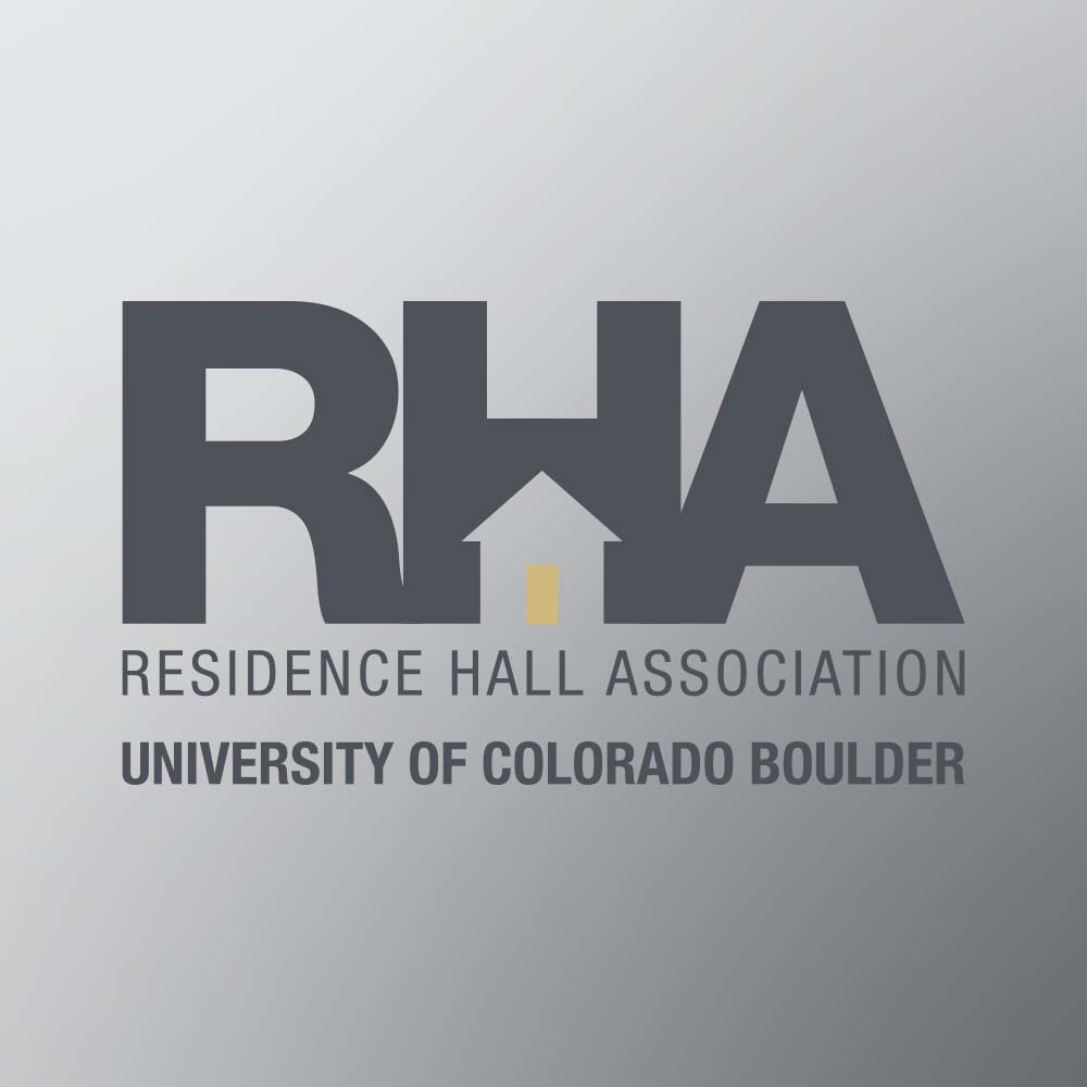
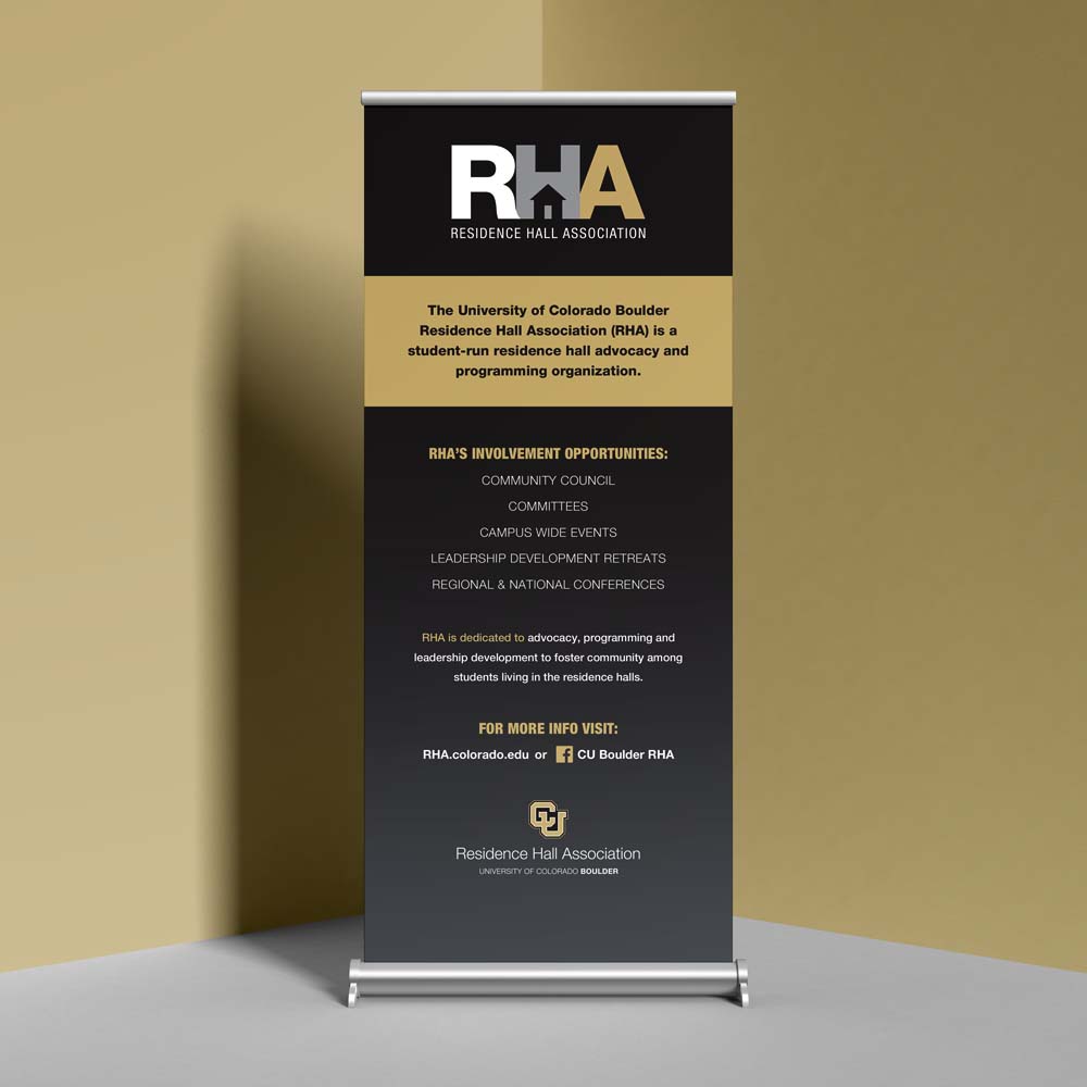
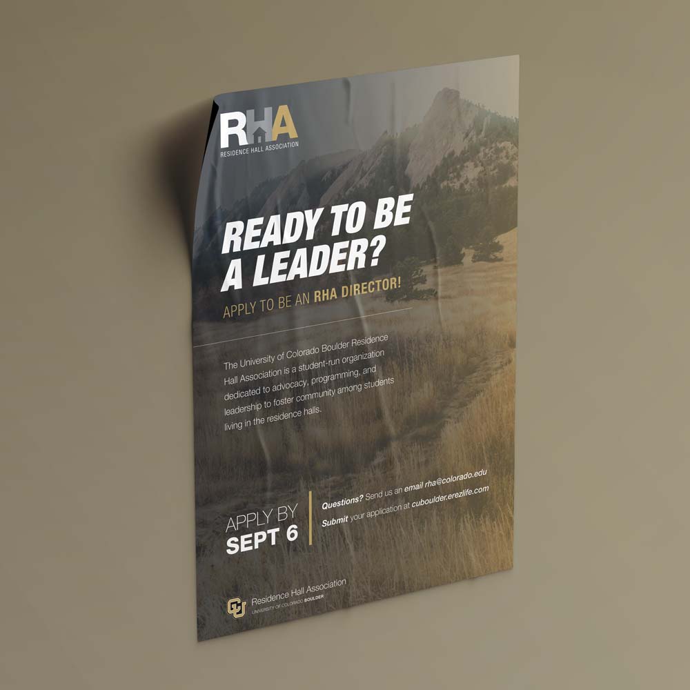
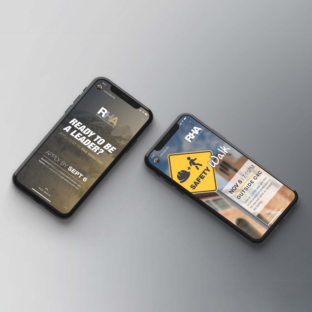
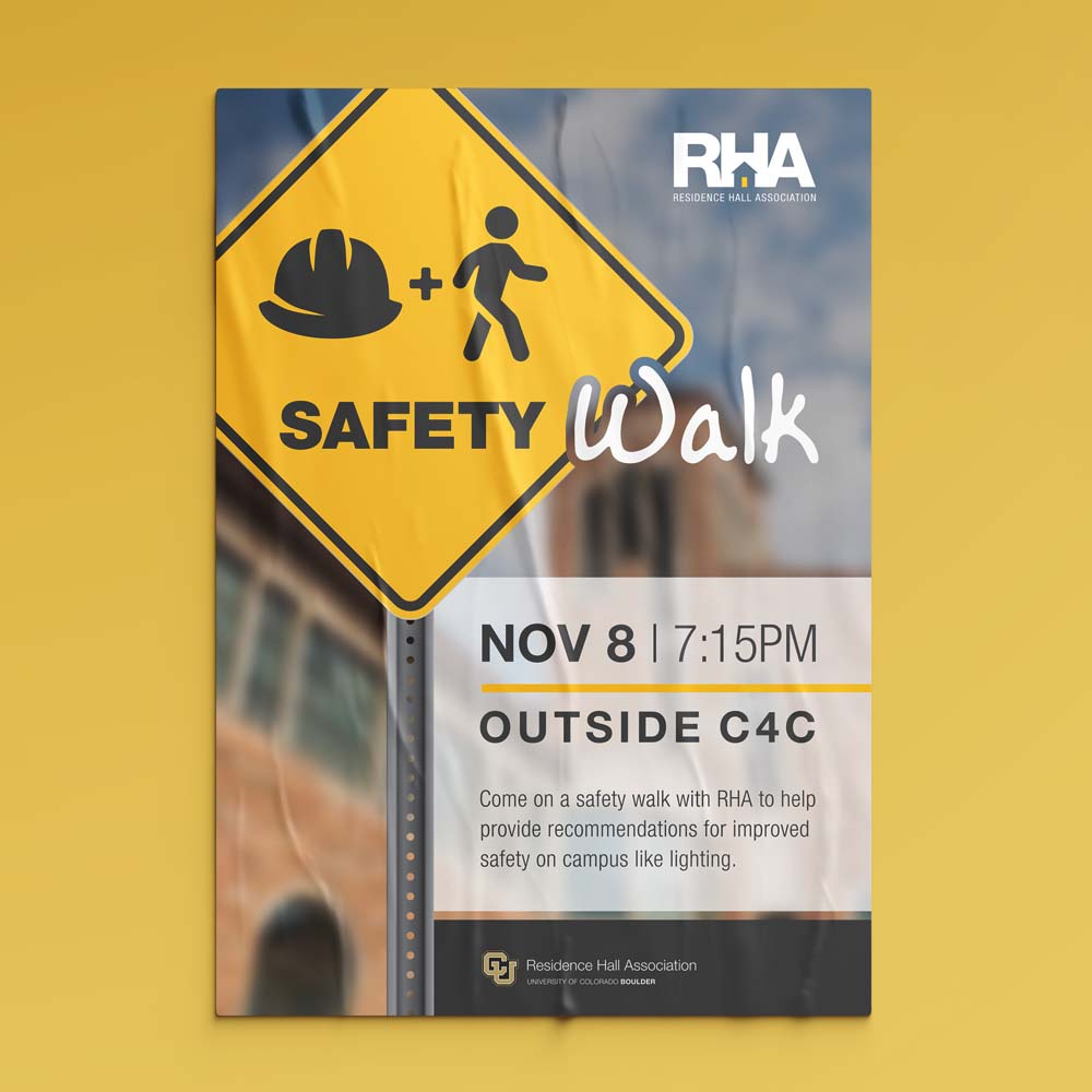
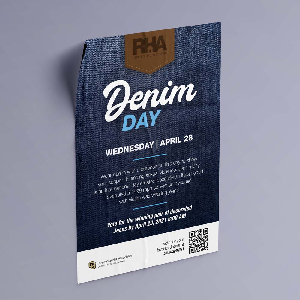
This year the Residence Hall Association (RHA) wanted to rebrand with a new wordmark and overall more unified look for their marketing. To that end, I created a handful of wordmark options of which they chose the one below which included a house in the negative space of the "H". One of the main goals of RHA is to make the students on campus feel like their hall is their home and I though the imagery, while simple, did a great job of conveying that intention. The other materials are examples of work I have created after the wordmark was developed for recruitment and events for RHA.
Client | University of Colorado Boulder - RHA
Project Type | Branding, Print Design, and Digital Design